Purpose: The Want Factor Scoring chart allows users to view each location’s Want Score, as well as how each primary category score contributed to the overall score on a scale of 1 to 10, with 10 being the best. A user can also conduct quick sensitivity analysis in this section by adjusting primary, secondary, and tertiary category weights to view scoring changes in real time.
Overview: The Want Factor Scoring chart, accessed by selecting the Want Factor Scoring button located under the Want Scoring column on the Charts page, displays each location’s Want Score (overall score comprised of each primary category score), as well as how each primary category score contributed to the overall score on a scale of 1 to 10. The chart displays each contributing category in a different color to distinguish its value and highlight its impact to the overall score. The red vertical line identifies the score value which is fifteen percent (15%) below the top location score. Users can reference this line as a reference point to understand which locations might be competitive when compared to the top location options. Locations with scores below this line are likely not competitive options.
The Want Factor Scoring chart allows users to select categories, location statuses, location labels, and even adjust primary, secondary, and tertiary category weights.
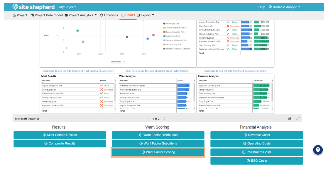
Where Do You Find the Want Factor Scoring Chart?
How to: A user can adjust the format of the location labels in the chart by selecting an option in the Location Label Format dropdown menu located in the top left-hand corner.
A user can edit what location statuses are included in the chart by selecting and/or deselecting Retained, Marginal, Withdrawn, Eliminated, or any combination of the four options.
Specific categories for comparison can be adjusted by selecting and/or deselecting the items listed under Categories to Include.
Want Factor Scoring Chart Location Modifications
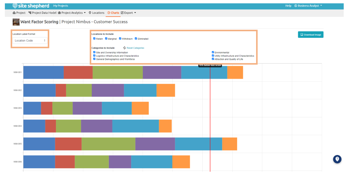
A user can control the weights, located below the bar chart, of each primary, secondary, and tertiary category. These weights indicate how each location is scored, based on the relative importance of each primary category. The weights must add up to one hundred percent (100%) and results of the weight changes are shown in real time on the Want Factor Scoring chart as adjustments are made.
Note: Any changes to the category values in the Charts section will affect changes throughout the entire project.
A .jpg file of the chart image can be downloaded by selecting the Download Image button located in the top right-hand corner of the page.